Digital Asset Scorecards
Last month I reviewed Marty Raffy's great book Applied Security Visualization. Recently I've been considering ways to describe systems in my environment using visual means instead of text. I decided to try sharing the following visualization, which I call a Digital Asset Scorecard. I've created a zipped .ppt explaining this idea, but I'll share it here as well.
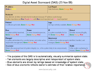
The Digital Asset Scorecard for a single system is shown below. As you will see shortly, each cell of the box is color-coded depending on its state. Here I use blue and tan to separate categories of elements.
The blue section began as a 4 x 4 table. I merged certain cells as a way to show that some elements (like Assurance) is more important than others (like Base, aka Baselined). These are completely subjective; you could change them, remove them, add them, and so on.

On a single slide I can show 16 systems. The choice of a 4 x 4 arrangement is deliberate; it's a /28. This will make sense later.

I've done some sample color-coding to show how this might appear on a security or operational dashboard of some type. This network is mostly green, which we intuitively know is "good."

Here I've introduced some problems, and they can be seen by less green.

This subnet has some severe problems.

If you reduce the size by 75% you can now arrange systems on a 16 x 16 basis. Now you're depicting an entire /24.

I conclude with a few other ideas.

I'm not sure if I will end up trying to develop a system at work that implements these ideas. It might be possible to create a front-end that accepts feeds from a variety of sources in order to populate the color-coded cells.
Please let me know if I've re-invented someone's wheel or if you have some ideas. I could point to Raffy's sections on Audit Data Visualization or Business Process Monitoring as being similar already.
Richard Bejtlich is teaching new classes in DC and Europe in 2009. Register by 1 Jan and 1 Feb, respectively, for the best rates.
The Digital Asset Scorecard for a single system is shown below. As you will see shortly, each cell of the box is color-coded depending on its state. Here I use blue and tan to separate categories of elements.
The blue section began as a 4 x 4 table. I merged certain cells as a way to show that some elements (like Assurance) is more important than others (like Base, aka Baselined). These are completely subjective; you could change them, remove them, add them, and so on.

On a single slide I can show 16 systems. The choice of a 4 x 4 arrangement is deliberate; it's a /28. This will make sense later.

I've done some sample color-coding to show how this might appear on a security or operational dashboard of some type. This network is mostly green, which we intuitively know is "good."

Here I've introduced some problems, and they can be seen by less green.

This subnet has some severe problems.

If you reduce the size by 75% you can now arrange systems on a 16 x 16 basis. Now you're depicting an entire /24.

I conclude with a few other ideas.

I'm not sure if I will end up trying to develop a system at work that implements these ideas. It might be possible to create a front-end that accepts feeds from a variety of sources in order to populate the color-coded cells.
Please let me know if I've re-invented someone's wheel or if you have some ideas. I could point to Raffy's sections on Audit Data Visualization or Business Process Monitoring as being similar already.
Richard Bejtlich is teaching new classes in DC and Europe in 2009. Register by 1 Jan and 1 Feb, respectively, for the best rates.


Comments
Redseal does something similar with one of their dashboards. They use vulnerability data combined with firewall config and self rated 'importance' to build colorized maps of the systems in an enterprise. The effect tends to steer you towards the systems that in theory need the most remediation. Your concept takes that up to an abstract/strategic level, focusing on non-tactical metrics, such as 'governance'.
I'm not sure that viewing hosts by subnet is really interesting. That might tell me about a subnet, but I'm far more likely to be interested in an application rather than a subnet. Having a visual metric such as this available to use to compare the hosts that make up an application stack might be interesting, and even more interesting, aggregating and rolling the data up to a business unit level, where the various business units apps get directly compared against each other. There's nothing like peer pressure among VP's to get action on long outstanding issues.
I'm amused by your inclusion of 'Owner'. You must have the same issue I do, where apps that do not have an actively engaged owner tend to degrade over time, both security and operationally. And in our case, the unowned apps then to be clustered in certain business units. Hence my thoughts on aggregated data visualization.
--Mike
Most environments that are mature enough to be thinking in this direction are large enough to make visualization problematic. Getting feedback of this kind on 10,000 nodes is difficult.
I know we might be able to condense by putting an entire class C into a single node, etc., but then we loose depth in the initial view. It's not an easy problem to solve.
Anyway, nice idea.
Take this concept to an semi automated, GUI driven software and it takes away some of the limits, allow sorting and search.
I for one think this is a great idea, that if well implemented could potentialy scale (to a certain limit)
At one point I was considering something like this but time oriented where it would flow like a seismograph except multi-band with no amplitude.. so it would be a streaming flow of color and as systems deviate from compliance the colors shift. The general idea being to capture a large world view which blends the compliant but highlights the issues.